A Beginner’s Guide to Blog Post Graphics: Using Visuals To Gain Organic Traffic
When your time is limited, and you feel like you’ve already done everything you can to get more customers, gaining organic traffic feels like a distant future.
You’ve already read the blogs, and you know what you need to do: optimise your content.
But when you think of optimising content, you might automatically opt for rewriting and ehhancing written text.
Which isn’t wrong.
Writing in a way that’s engaging, captivating, and interesting to the reader whilst considering search engines is important when it comes to creating great material.
However, what’s really enticing to the reader has begun to shift away from the written word and more towards visuals.
Which is why if you want to have a positive impact in the online space with little effort, creating original media and infographics has never been so important.
You might think that to do this well you need to hire specialist services.
But by using platforms like Canva, you have the power to create just as compelling media from the comfort of your own computer in one afternoon, instead of spending months learning Adobe photoshop.
By the end of reading this article, you’ll understand why graphics are essential when creating online content and how to create your own media that’s optimised for SEO and social media sharing.
6 Reasons To Add Graphics to Your Blog Posts Today
Nowadays, it’s hard to imagine a good piece of content without some kind of visual imagery.
But why?
There are a few main reasons why graphics are essential to online content:
Reason #1 – Increase Organic Traffic
Platforms like Google Discover, Google Image and video search directly recommend using high-quality imagery in content to increase visibility.
And there’s a reason.
In general, web content across the board containing images or videos receive more views. Facebook posts with images, for example, see 2.3X engagement than those without.
When analysing 1 million articles, Buzzsumo also found that articles with images throughout, received double the social media shares than those with fewer images.
The same trend can be seen with infographics, which can increase website traffic by 12%.
Reason #2 – Faster and Clearer Communication
One of the key reasons why graphics have an increased click-through-rate than written text alone, is because they’re a quick way to communicate key information to the user.
So much so, that it’s suggested visuals are processed between 6 and 600 times faster than language.
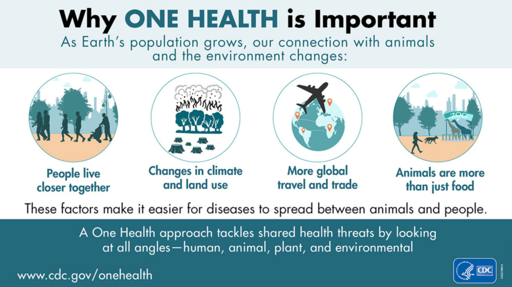
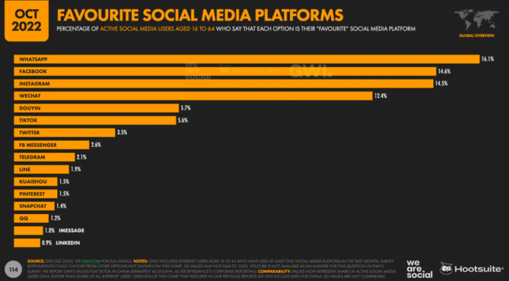
Media such as infographics can also help clearly communicate complex topics.
For example, this infographic on the concept of one health neatly summarises and explains the key reasons in a way that is visually simple, concise, and easy to remember.
Reason #3 – Humans are Highly Visual
The well-chosen colours, captivating headlines, and clear format of visuals makes them easy to understand.
This ease of consuming visual media and its abundance on the web, has also translated to people displaying preferences for them when it comes to learning new things.
In fact, according to HubSpot, 54% of customers want to see more video content from brands they liked compared to other content types.
And it’s not surprising. Research has shown that 65% of the population are visual learners, highlighting the importance of including rich media in your content.
Reason #4 – Increase Engagement
When designed well, blog graphics can be exciting, captivating user attention and getting people interested in browsing your content.
So much so, that posts which include images have been found to produce 650% higher engagement than text-only posts.
If people like it enough, they can even share it with others or use it on their own platforms, providing perfect blacklinking opportunities for your content.
The more people share or use your image, the higher the click-through rates and visibility of your service or product.
Reason #5 – Help Decrease Reader Confusion
Sometimes it can be difficult to process complex information through writing.
Images, videos, or infographics can help dispel confusion by providing more clarity on exactly what it is you want to say.
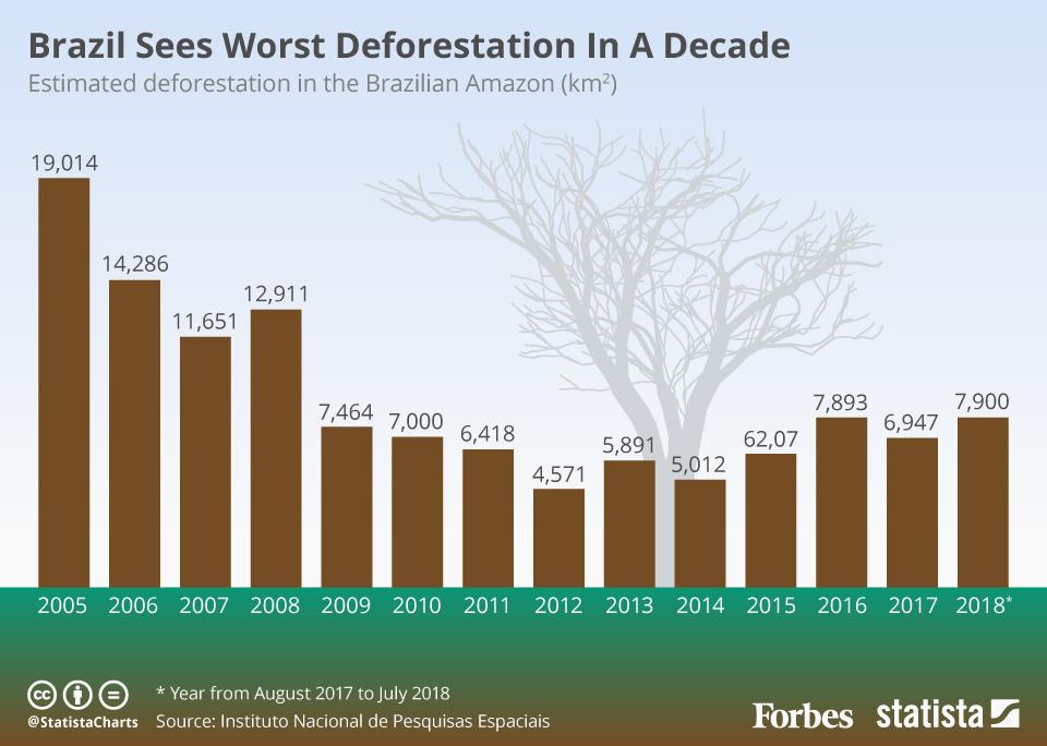
This is best exemplified with articles featuring data analysis.
Having an infographic provides a snapshot summary of the information, and since it’s a preferable medium, is more likely to stick in the reader’s mind.
Reason #6 – Adds Brand Credibility
Creating your own blog graphics means you can create a particular style that will be recognisable to users whilst they’re searching the web.
Let’s take Hootsuite as an example. They’ve created several infographics in the style below, being sure to include brand elements like logos and colour schemes, making them easily identifiable.
The uniqueness of your visuals can directly help to raise awareness about your brand and inadvertently increase your credibility on the results page.
How to Create Graphics That are SEO-Optimised
People may think that SEO and images are unrelated.
But that’s not true.
As with most online content, it’s important to consider SEO when uploading graphics to your website.
There are three main ways you can make sure your content is optimised for search engines:
1. Use Relevant Original Content
If you’ve spent time browsing online, you may have noticed the same images pop up time and time again.
It may come as no surprise then that the stock photography market is expected to reach $4.8 billion by 2028.
And whilst there’s nothing inherently wrong with using stock material, it can have a negative effect on the ranking of your page.
When sharing their own image SEO best practices, Google revealed that they discourage the publishing of pages without original content.
Sometimes I use stock photos because it can be difficult to find the time, energy, and resources to obtain original material.
One tip that has helped is to create a content schedule, where you can bulk together your article ideas in advance, leaving you plenty of time to gather the team together for photo shoots.
If you’re unable to do this, you can just set aside an hour or two for taking generic images from your surroundings that you know you may be able to use later down the line. And if that’s not an option, you can even use screenshots.
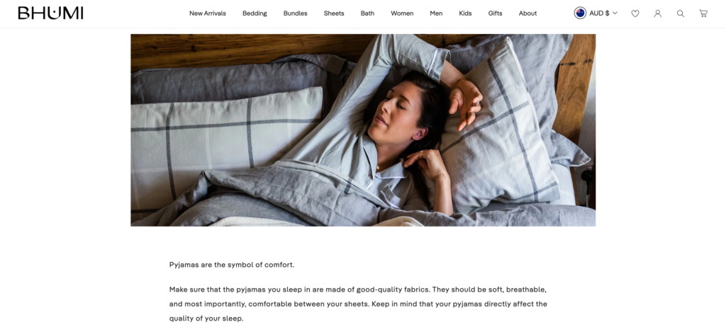
But no matter the image you choose, whether stock or original, it has to be relevant to what you’re writing about.
A great example is the article below. The main theme is answering whether it’s healthy to sleep in pyjamas, complemented with an image of a woman in sleepwear.
2. Include Keywords in Your Filename
When you first import an image to your computer, it’s likely to be saved under a random number such as “IMG_348776”.
Since Google scans image information, the filename itself is prime real estate for SEO.
That being said, there are some nuances.
As with titles, you don’t want to over-do the keywords but rather provide a description of what the image is about.
More generally, make sure to use hyphens rather than spaces, and exclude any special characters.
Say you decide to write an article on your favourite guitar brands of 2023 and decide to use the image below.

Instead of giving the image a generic name, you could change the filename to ‘best-brand-guitars-2023’ to give Google more context.
Creating a filename is a matter of quality over quality, so it’s recommended to keep them short and sweet under 5-6 words.
3. Don’t Forget About Alt Text
Often overlooked, alt text is an important element of optimising images for SEO.
Google relies on factors like alt text, along with vision algorithms, in order to understand more about the visual you’re uploading.
According to Hubspot, “Alt text is a major factor that determines whether or not your image or video appears in the SERP and how highly it appears”.
Including alt text also increases the accessibility of your site for those who are visually-impaired and using screen-readers.
4. Size Matters
It’s important not just to think of the content of your media, but also how it relates to existing guidelines and recommendations.
When it comes to image sizing, larger visuals tend to be more favoured than small images.
That being said, you don’t want to upload an image too large that it doesn’t load well and impedes on the user’s experience.
Google’s general advice is that large images need to be at least 1200px wide.
Creating Blog Post Graphics for Social Media
One of the main aims of creating your own blog post graphics is for people to share them.
However, one of the challenges is that various social media platforms have different requirements when it comes to uploading images.
To ensure that your content will feature and provide a user-friendly experience, it can be helpful to refer to the platform’s guidelines during the designing process.
You can find a comprehensive cheat sheet to image sizes here.
In addition to following recommendations, create inspirational, visually-compelling content, so qualities like solid lighting, great framing, and the consistency of your publishing schedule will make a big difference to overall success.
Canva Case Study: KindMark
Canva is an online platform that unlocks a cornucopia of design tools for the non-designer, allowing you to create innovative and engaging graphics, all on your own.
But where do you begin?
In this case study, I’ll be using Canva to create a centralised graphic hub for KindMark.
How to Create a Brand Kit in Canva
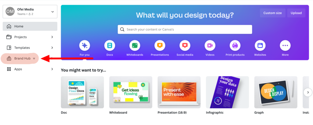
The best practice for beginning your blog post graphic journey is to set up your brand kit, as it allows you to keep all of your brand aesthetics in one place.
You can do this by first heading to Brand Hub.
Create a new Brand Kit.
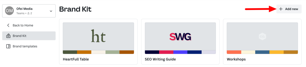
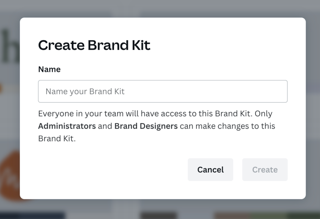
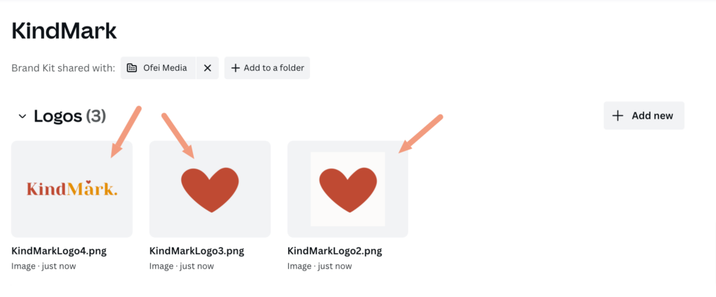
You will then be redirected to a page where you can upload brand logos.
Click “Add new” or simply drag any relevant media files.
You will also see the option to add a colour palette. Simply click “Add new” and select your brand colours.
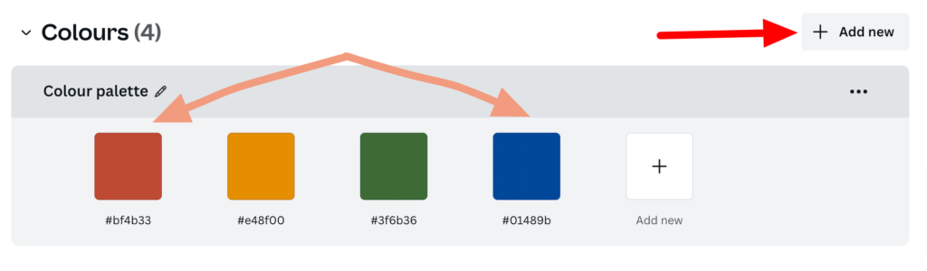
If you haven’t yet decided on a brand colour palette, not to worry. Focus on choosing one dominant colour. This allows you to then add colours that are complementary, and slowly branch out your aesthetic.
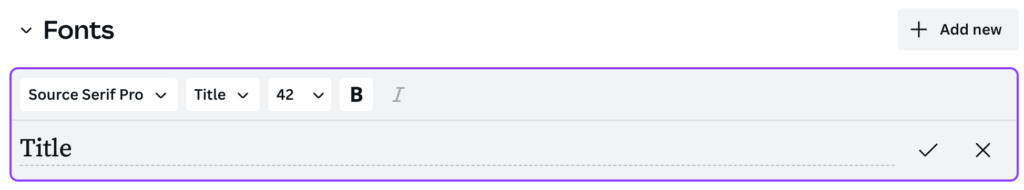
The next step is to add your typography.
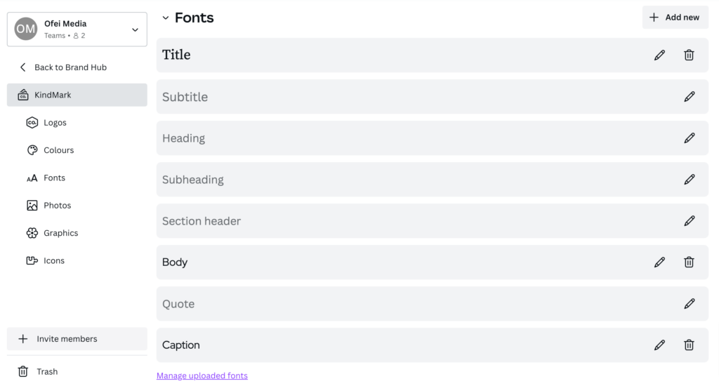
Simply click on the pencil button on the right hand-side to select your brand fonts.
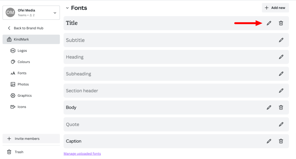
For KindMark, I’ve first gone ahead and selected my title font.
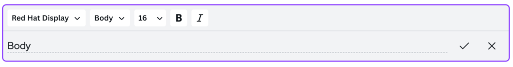
Followed by the font used for body of texts.
You also have the option to add extras such as any photos, graphics, or icons.
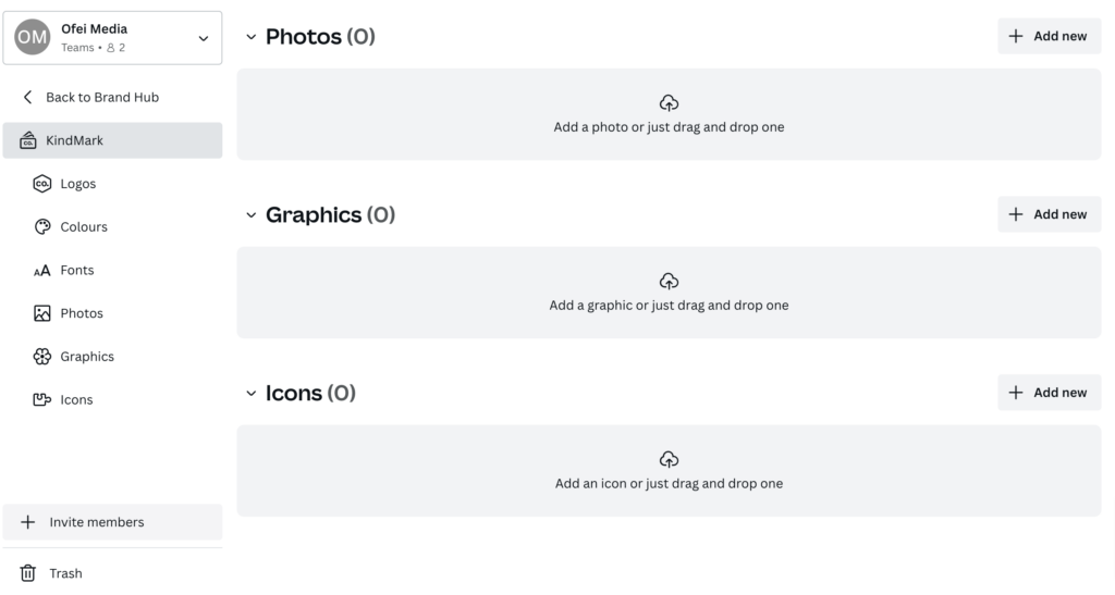
Once you’ve gone ahead and uploaded your brand’s media, the mission of creating your own brand kit is complete!
As you can see, having a brand kit allows you to upload your logo, colour palette, and font preferences all in one place, ensuring designs can be kept on-brand when working alone, or within a team.
Utilising Branded Templates
Having branded templates is a great way to simplify the content creation process, whilst staying on track with your company’s unique look.
You can create templates for different categories to ensure you have a design ready to use for social media platforms like Instagram, Pinterest, and Facebook, as well as general designs for work-related events like presentations.
Simply choose “brand templates” on your brand kit page.
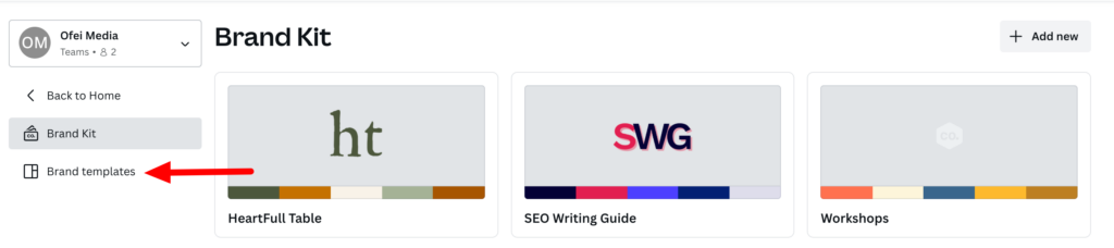
You will then be redirected to a home page where you can view any current templates. Select “add new”
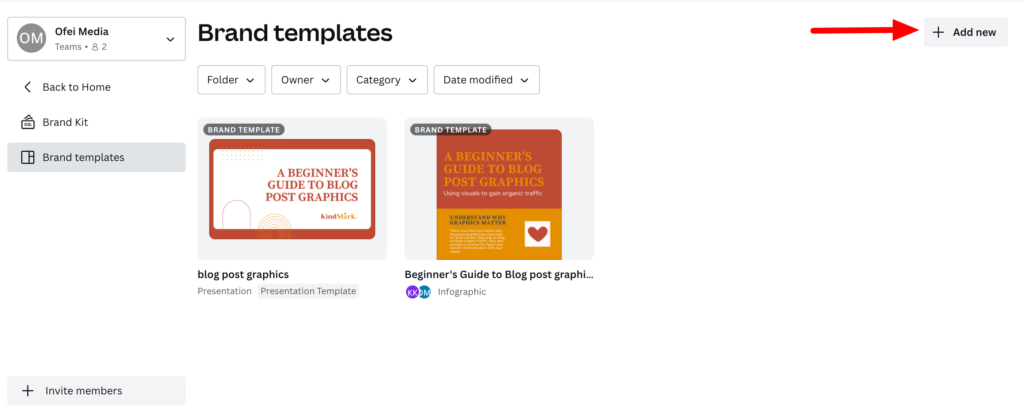
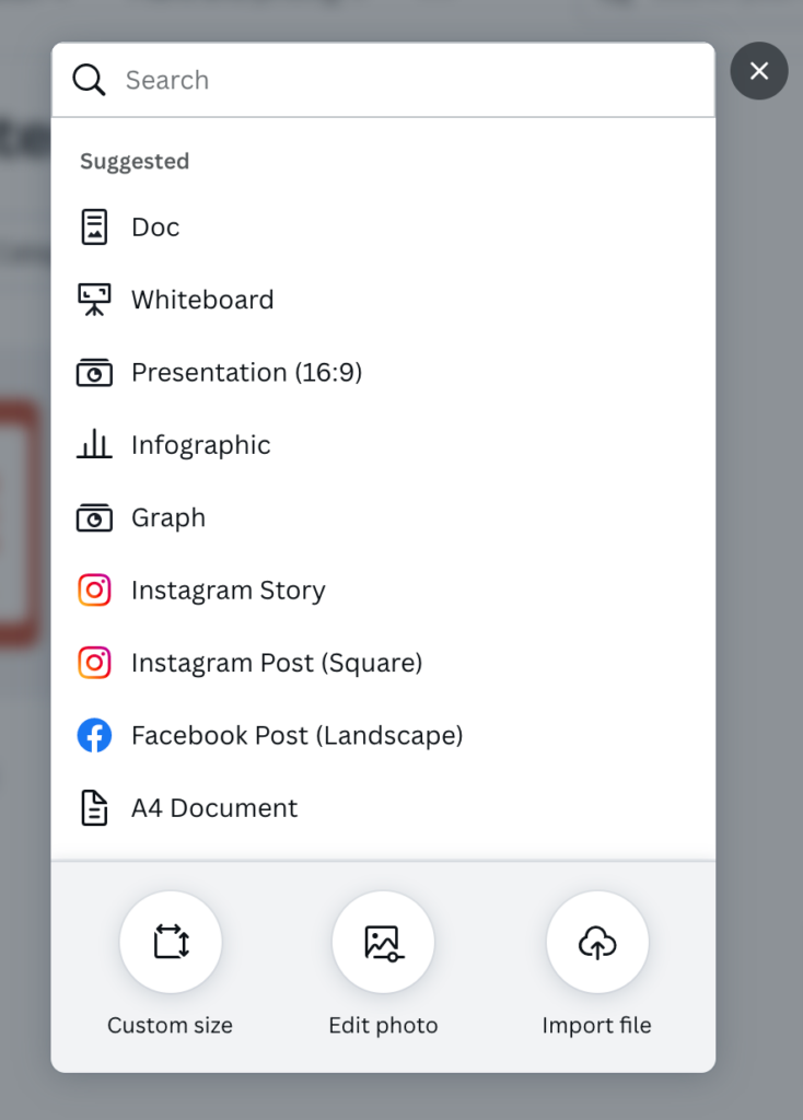
You’ll be given a selection of options, so choose the type of media you’re looking to create.
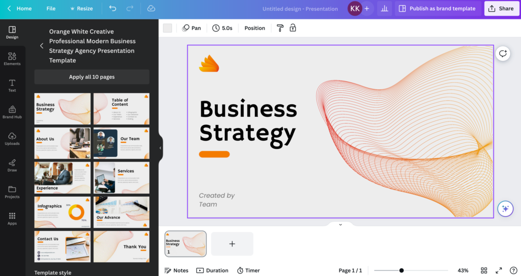
In my case study, I’ve chosen to create a presentation. You’ll notice Canva automatically gives you a blank slate, so the next step is to choose an existing template that you like the look of.
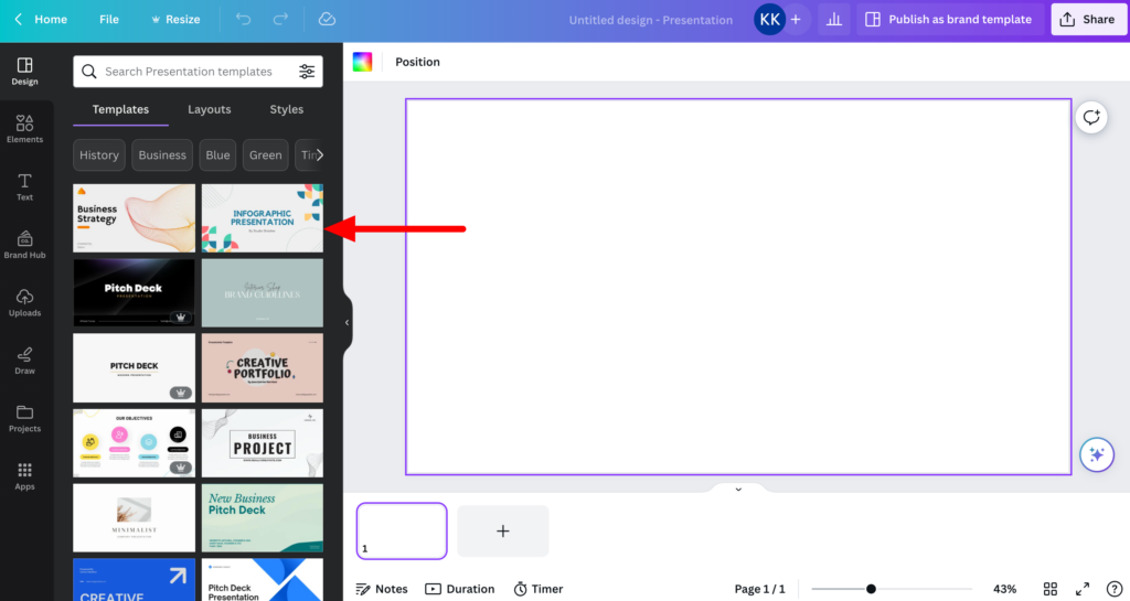
Once you have selected a template, you’ll see it pop up on your screen.
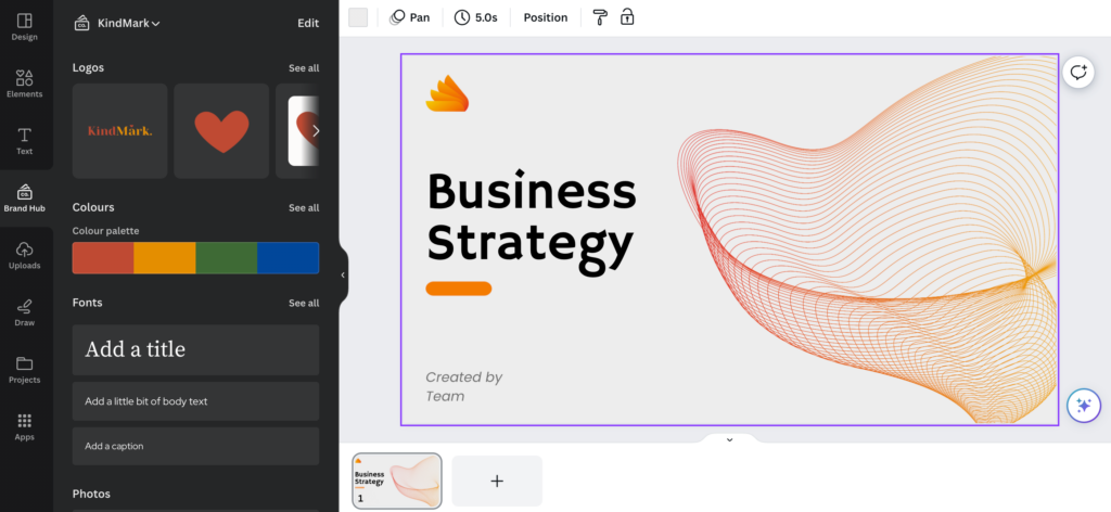
The next stage is to alter the style of it so that it fits your branding. This is where Brand Hub comes in.
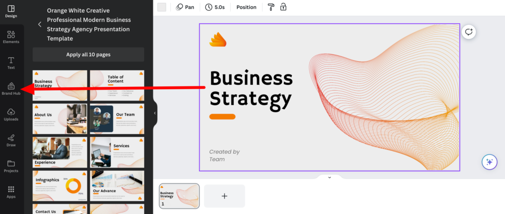
You’ll be given the option to change the colour palette, fonts, and add your own logos from the left sidebar.
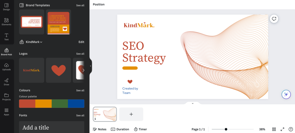
In this example, using the Brand Kit, I can change the style of the presentation above to fit KindMark’s aesthetic like so.
Top Things to Consider When Making Infographics
When you’re on the journey of creating visual media to support written content, you want to ensure that you’re doing it well.
Infographics are a fantastic way of summarising key information, breaking down complex ideas, and catching the attention of the reader.
But there are a few key points to consider when planning your project.
Start With Defining Your Audience
Crafting a design that does well in the search results involves understanding the intention of the person reading your post, or rather, who it is you’re writing for.
Just like with writing SEO titles, you want to create an infographic that will be not only relevant to the user, but also beneficial.
A great way to clarify your intention is to refine your company’s persona profile.
Rely on Your Brand’s Style
Different audiences will want different things, so it’s important to make sure you choose a style that is not only on brand, but also matches the user intent.
You can have a flyer with the right colour, font, and logo, but the shapes or illustrations used may not be fitting for the intended purpose.
Take this edit of a different presentation template I created for KindMark.
It wouldn’t make much sense for me to include an illustration of a puppy on the slide, even if I think it’s sweet.
Don’t get me wrong. It’s perfectly okay to be abstract and experiment with different designs.
But make sure it’s tailored to the overall topic you’re talking about.
Collaboration Not Competition
There’s a lot of visual media out there on the web, and it’s easy to get caught in a loop, competing and comparing your content performance with others.
The truth of the matter is that the key to success is collaboration not competition, so don’t be afraid to look for inspiration from other players you admire in the field.
In fact, this can help spark ideas and provide guidance on what works and what doesn’t.
Sketch it Out
Some of us are more tech-savvy than others, and that’s okay.
The intention of platforms like Canva is to deconstruct the complications when it comes to designing, making the whole process a lot more simplified and user-friendly.
However, sometimes it can still be helpful to take the time to sketch your ideas out on paper.
Whether it’s for a specific infographic, or even the composition of a photo you’d like to plan, putting pen to paper can help provide that extra boost of creativity, especially since a notebook has the handy advantage of being able to follow you wherever you go.
Have a Hit Headline
Good copywriting doesn’t just apply to the article itself.
It’s important that the infographic is easy to read and has a catchy headline that incorporates keywords indicating what your article is about.
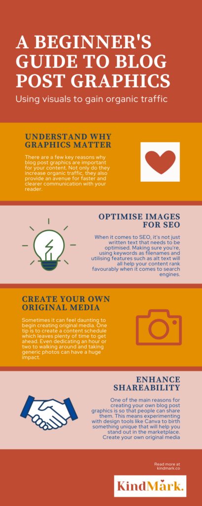
In this article summary below, I’ve included keywords like “blog post graphics”, as well as used words like “beginner”, indicating that this is a guide for the non-designer.
Don’t Forget to Have Fun!
Whilst there are many things to consider when creating your own blog post graphic, it’s important to remember to take the pressure off and enjoy the creative process.
In fact, getting stressed can actually affect the level of your creativity.
If you’re feeling the pressure to perfect your visual content and can’t seem to move forward, always remember you can see how your infographics perform over time and make adjustments where necessary based on what you find.